Lokate.Africa
Categories
Events
Mobile App
AI
Duration
2024 - 2025
Role
UI/UX Deisgn
Client
Lokate Africa
Overview
Lokate.Africa entered a crowded market where Nigerians juggled multiple apps to plan a single night out. The business bet was simple:
Become the single destination for urban discovery by connecting three disconnected verticals (events, dining, accommodation) into one intelligent platform.
The goal wasn't to compete on features but to own the entire user journey, from "What should I do tonight?" to booking confirmation.
The Problem
Users spend almost an hour and multiple apps to plan one night out
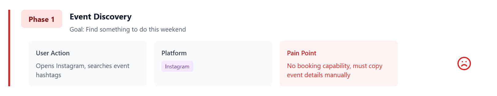
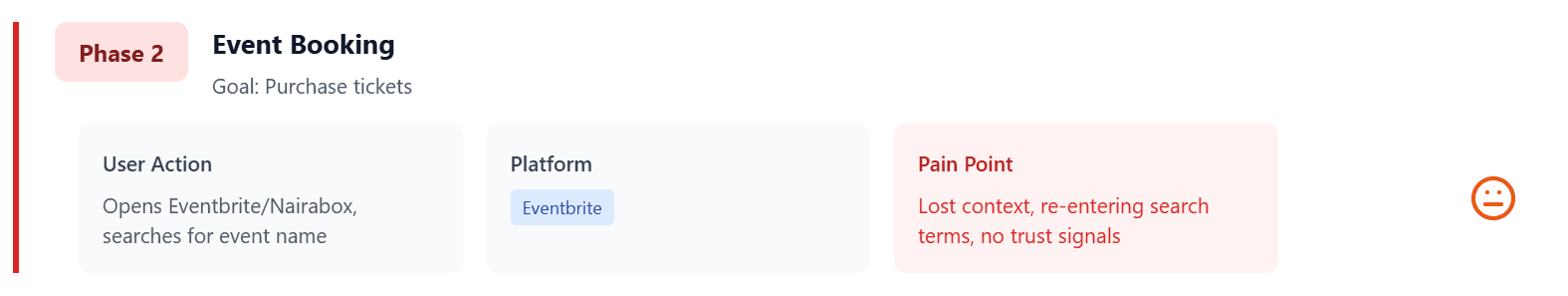
Planning Friday night in Lagos meant opening three apps: one for events, one for restaurants, one for prices. Forty-seven minutes later, users were still deciding. This friction killed conversions. When users bounced between platforms, everyone lost the sale.
The missed opportunity: someone booking a concert ticket likely needs dinner nearby and possibly accommodation. No platform was connecting these dots.
Research surfaced four critical insights:
80% of users abandoned planning after checking two platforms
Trust was the biggest barrier (65% worried about event authenticity)
Social proof drove 84% of decisions, but platforms provided little context
Users spent 47 minutes on average planning one evening out

Opportunity
Designing one system that anticipates the complete journey
If we combined discovery, validation, and booking into a single flow, we could reduce multiple journeys to a single flow. The contextual system anticipates needs: book a concert ticket, instantly get restaurant suggestions nearby and accommodation options if you're travelling.
How did I approach this?
I started by mapping the current state journey. Users were constantly losing information between apps and making decisions in isolation.
My strategic bets:
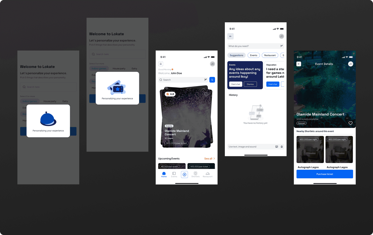
Context-aware home screen. The feed adapts to time, location, and behaviour. Morning brings brunch spots; evening shows tonight's events.
Conversational discovery. I pushed for an AI assistant (Paye) over traditional filters. "Show me jazz clubs near VI" beats scrolling dropdowns.
Cross-category bridges. The system recognises patterns and surfaces related suggestions. Concert ticket → nearby dinner → accommodation in one flow.
We based this on two core personas: The Weekend Planner (organising outings) and The Business Nomad (finding quality on tight schedules).
The opportunity was clear: design for the complete journey, not individual touchpoints.
Solution
Four features that unified the experience
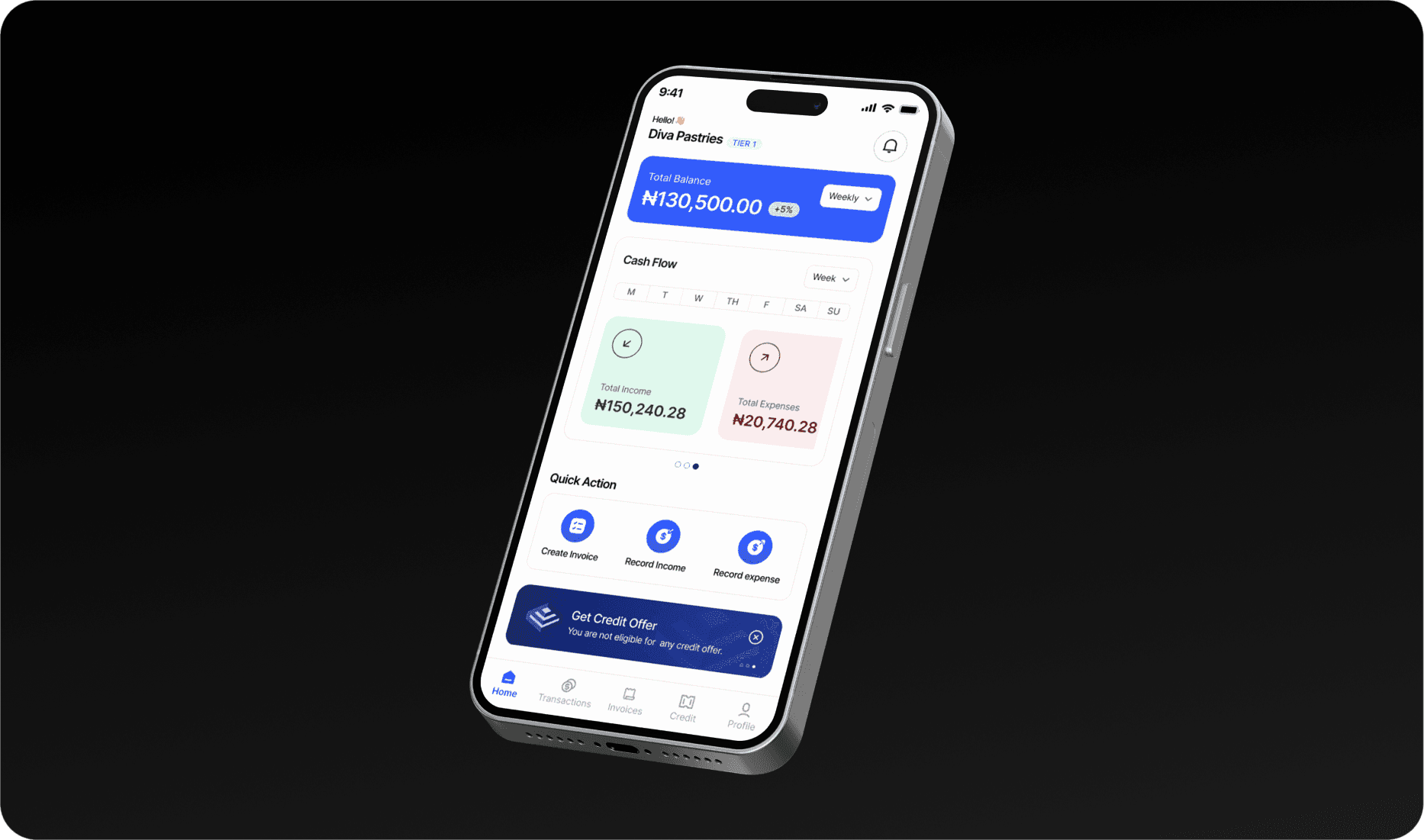
Dynamic home screen
I designed the homepage to respond to context: GPS shows nearby options, user preferences to tailor and predict the needs of the user and past experiences to refine recommendations.

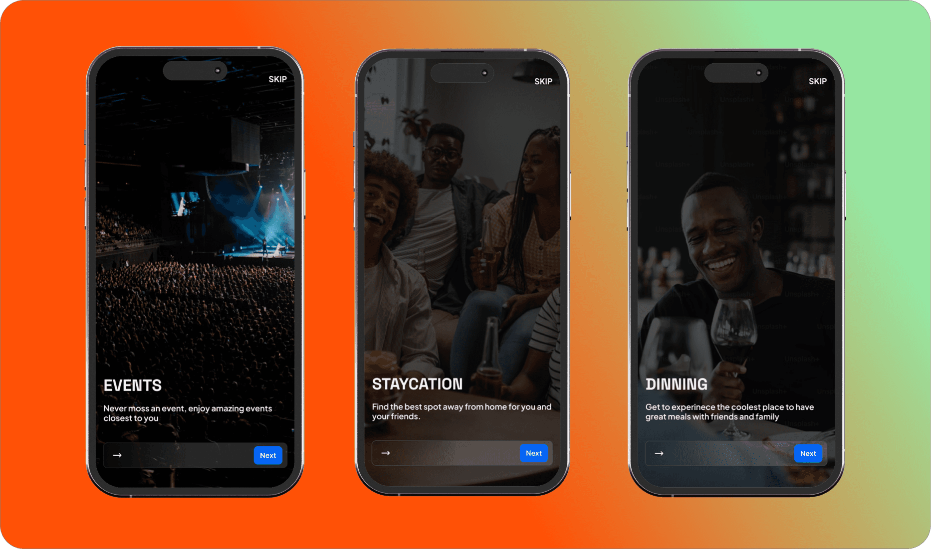
Unified “Explore” Hub
Users browse curated collections or jump into real-time stories showing what's happening now. The story format borrows from social platforms users know, adding social proof without cognitive load.

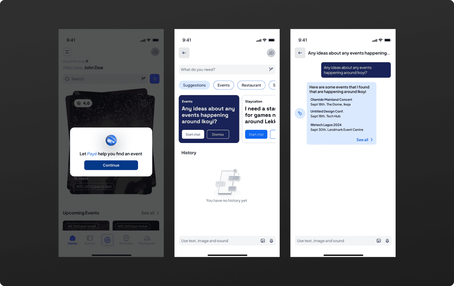
AI-Powered Search
I designed Paye to understand natural queries: "Any ideas about any events happening around Ikoyi?" It learns preferences over time, solving decision paralysis.
Connected Bookings
I turned the booking confirmation into a launchpad. Book a concert, get pre-show dinner options within walking distance and accommodation if you're traveling. Every suggestion is contextual.

Conclusion
Why it worked: context, trust, and connected experiences
The contextual recommendation system changed how users planned outings. By designing for the complete journey rather than isolated tasks, I created a product that anticipates needs. Users weren't just booking faster; they were discovering places they wouldn't have found otherwise.
Users don't want more options; they want the right option right now. The homepage's contextual intelligence outperformed static feeds because it respects users' time.
Trust was the barrier, so I made social validation visible everywhere. Real-time activity, peer recommendations, and authentic reviews turned scepticism into confidence.
The most powerful moment isn't when users book an event. It's when they book the event, accept the dinner suggestion, and add it to their calendar without leaving the app. That's when behaviour changes.
Next Phases:
As we approach the end of the development phase to launch version 1, we are pushing for dark mode to improve accessibility and extend usage into late-night hours in the verson 2. The bigger opportunity is expanding Paye to recommend complete itineraries (event + dinner + stay) as a single package.
The product isn't finished. It never is. But we've built something that genuinely changes how people experience their city. That's the kind of work that matters.


Lokate.Africa
Categories
Events
Mobile App
AI
Duration
2024 - 2025
Role
UI/UX Deisgn
Client
Lokate Africa
Overview
Lokate.Africa entered a crowded market where Nigerians juggled multiple apps to plan a single night out. The business bet was simple:
Become the single destination for urban discovery by connecting three disconnected verticals (events, dining, accommodation) into one intelligent platform.
The goal wasn't to compete on features but to own the entire user journey, from "What should I do tonight?" to booking confirmation.
The Problem
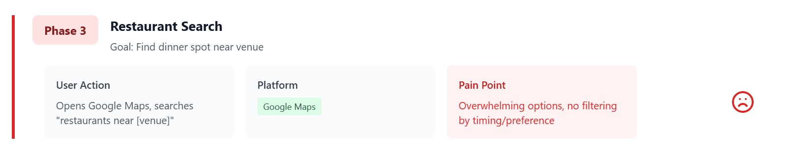
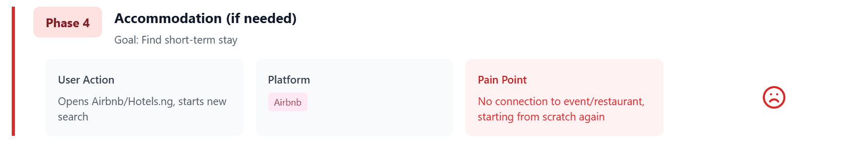
Users spend almost an hour and multiple apps to plan one night out
Planning Friday night in Lagos meant opening three apps: one for events, one for restaurants, one for prices. Forty-seven minutes later, users were still deciding. This friction killed conversions. When users bounced between platforms, everyone lost the sale.
The missed opportunity: someone booking a concert ticket likely needs dinner nearby and possibly accommodation. No platform was connecting these dots.
Research surfaced four critical insights:
80% of users abandoned planning after checking two platforms
Trust was the biggest barrier (65% worried about event authenticity)
Social proof drove 84% of decisions, but platforms provided little context
Users spent 47 minutes on average planning one evening out
Opportunity
Designing one system that anticipates the complete journey
If we combined discovery, validation, and booking into a single flow, we could reduce multiple journeys to a single flow. The contextual system anticipates needs: book a concert ticket, instantly get restaurant suggestions nearby and accommodation options if you're travelling.
How did I approach this?
I started by mapping the current state journey. Users were constantly losing information between apps and making decisions in isolation.
My strategic bets:
Context-aware home screen. The feed adapts to time, location, and behaviour. Morning brings brunch spots; evening shows tonight's events.
Conversational discovery. I pushed for an AI assistant (Paye) over traditional filters. "Show me jazz clubs near VI" beats scrolling dropdowns.
Cross-category bridges. The system recognises patterns and surfaces related suggestions. Concert ticket → nearby dinner → accommodation in one flow.
We based this on two core personas: The Weekend Planner (organising outings) and The Business Nomad (finding quality on tight schedules).
The opportunity was clear: design for the complete journey, not individual touchpoints.
Solution
Four features that unified the experience
Dynamic home screen
I designed the homepage to respond to context: GPS shows nearby options, user preferences to tailor and predict the needs of the user and past experiences to refine recommendations.
Unified “Explore” Hub
Users browse curated collections or jump into real-time stories showing what's happening now. The story format borrows from social platforms users know, adding social proof without cognitive load.
AI-Powered Search
I designed Paye to understand natural queries: "Any ideas about any events happening around Ikoyi?" It learns preferences over time, solving decision paralysis.
Connected Bookings
I turned the booking confirmation into a launchpad. Book a concert, get pre-show dinner options within walking distance and accommodation if you're traveling. Every suggestion is contextual.
Conclusion
Why it worked: context, trust, and connected experiences
The contextual recommendation system changed how users planned outings. By designing for the complete journey rather than isolated tasks, I created a product that anticipates needs. Users weren't just booking faster; they were discovering places they wouldn't have found otherwise.
Users don't want more options; they want the right option right now. The homepage's contextual intelligence outperformed static feeds because it respects users' time.
Trust was the barrier, so I made social validation visible everywhere. Real-time activity, peer recommendations, and authentic reviews turned scepticism into confidence.
The most powerful moment isn't when users book an event. It's when they book the event, accept the dinner suggestion, and add it to their calendar without leaving the app. That's when behaviour changes.
Next Phases:
As we approach the end of the development phase to launch version 1, we are pushing for dark mode to improve accessibility and extend usage into late-night hours in the verson 2. The bigger opportunity is expanding Paye to recommend complete itineraries (event + dinner + stay) as a single package.
The product isn't finished. It never is. But we've built something that genuinely changes how people experience their city. That's the kind of work that matters.
Lokate.Africa
Categories
Events
Mobile App
AI
Duration
2024 - 2025
Role
UI/UX Deisgn
Client
Lokate Africa
Overview
Lokate.Africa entered a crowded market where Nigerians juggled multiple apps to plan a single night out. The business bet was simple:
Become the single destination for urban discovery by connecting three disconnected verticals (events, dining, accommodation) into one intelligent platform.
The goal wasn't to compete on features but to own the entire user journey, from "What should I do tonight?" to booking confirmation.
The Problem
Users spend almost an hour and multiple apps to plan one night out
Planning Friday night in Lagos meant opening three apps: one for events, one for restaurants, one for prices. Forty-seven minutes later, users were still deciding. This friction killed conversions. When users bounced between platforms, everyone lost the sale.
The missed opportunity: someone booking a concert ticket likely needs dinner nearby and possibly accommodation. No platform was connecting these dots.
Research surfaced four critical insights:
80% of users abandoned planning after checking two platforms
Trust was the biggest barrier (65% worried about event authenticity)
Social proof drove 84% of decisions, but platforms provided little context
Users spent 47 minutes on average planning one evening out
Opportunity
Designing one system that anticipates the complete journey
If we combined discovery, validation, and booking into a single flow, we could reduce multiple journeys to a single flow. The contextual system anticipates needs: book a concert ticket, instantly get restaurant suggestions nearby and accommodation options if you're travelling.
How did I approach this?
I started by mapping the current state journey. Users were constantly losing information between apps and making decisions in isolation.
My strategic bets:
Context-aware home screen. The feed adapts to time, location, and behaviour. Morning brings brunch spots; evening shows tonight's events.
Conversational discovery. I pushed for an AI assistant (Paye) over traditional filters. "Show me jazz clubs near VI" beats scrolling dropdowns.
Cross-category bridges. The system recognises patterns and surfaces related suggestions. Concert ticket → nearby dinner → accommodation in one flow.
We based this on two core personas: The Weekend Planner (organising outings) and The Business Nomad (finding quality on tight schedules).
The opportunity was clear: design for the complete journey, not individual touchpoints.
Solution
Four features that unified the experience
Dynamic home screen
I designed the homepage to respond to context: GPS shows nearby options, user preferences to tailor and predict the needs of the user and past experiences to refine recommendations.
Unified “Explore” Hub
Users browse curated collections or jump into real-time stories showing what's happening now. The story format borrows from social platforms users know, adding social proof without cognitive load.
AI-Powered Search
I designed Paye to understand natural queries: "Any ideas about any events happening around Ikoyi?" It learns preferences over time, solving decision paralysis.
Connected Bookings
I turned the booking confirmation into a launchpad. Book a concert, get pre-show dinner options within walking distance and accommodation if you're traveling. Every suggestion is contextual.
Conclusion
Why it worked: context, trust, and connected experiences
The contextual recommendation system changed how users planned outings. By designing for the complete journey rather than isolated tasks, I created a product that anticipates needs. Users weren't just booking faster; they were discovering places they wouldn't have found otherwise.
Users don't want more options; they want the right option right now. The homepage's contextual intelligence outperformed static feeds because it respects users' time.
Trust was the barrier, so I made social validation visible everywhere. Real-time activity, peer recommendations, and authentic reviews turned scepticism into confidence.
The most powerful moment isn't when users book an event. It's when they book the event, accept the dinner suggestion, and add it to their calendar without leaving the app. That's when behaviour changes.
Next Phases:
As we approach the end of the development phase to launch version 1, we are pushing for dark mode to improve accessibility and extend usage into late-night hours in the verson 2. The bigger opportunity is expanding Paye to recommend complete itineraries (event + dinner + stay) as a single package.
The product isn't finished. It never is. But we've built something that genuinely changes how people experience their city. That's the kind of work that matters.