AXA Mansard
Categories
Fintech
Mobile App
AI
Duration
2025
Role
Product Designer
Client
Axa Mansard
Overview
Redesigning for Impact: Establishing Market Competitiveness and Restoring User Confidence.
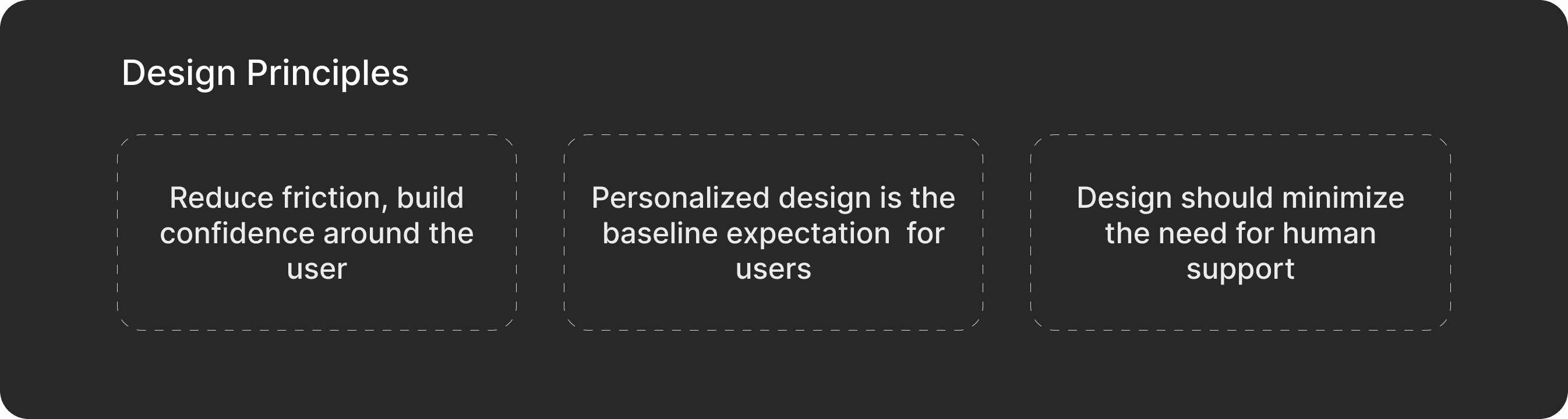
After failing to log into the AXA Mansard app three times in one session, I identified a critical problem: the app was losing users because existing features were difficult to use, not because features were missing. As both a user and designer, I saw an opportunity to fix the core usability issues driving customers away.
AXA Mansard is a Nigerian fintech/Insurance platform. AXA Mansard faces existential risk competing against fintech leaders like PiggyVest and Cowrywise that set higher UX standards in Nigeria.
The goal was to focus on strategic repositioning through design.

The Problem
The User's Nightmare 😥😥
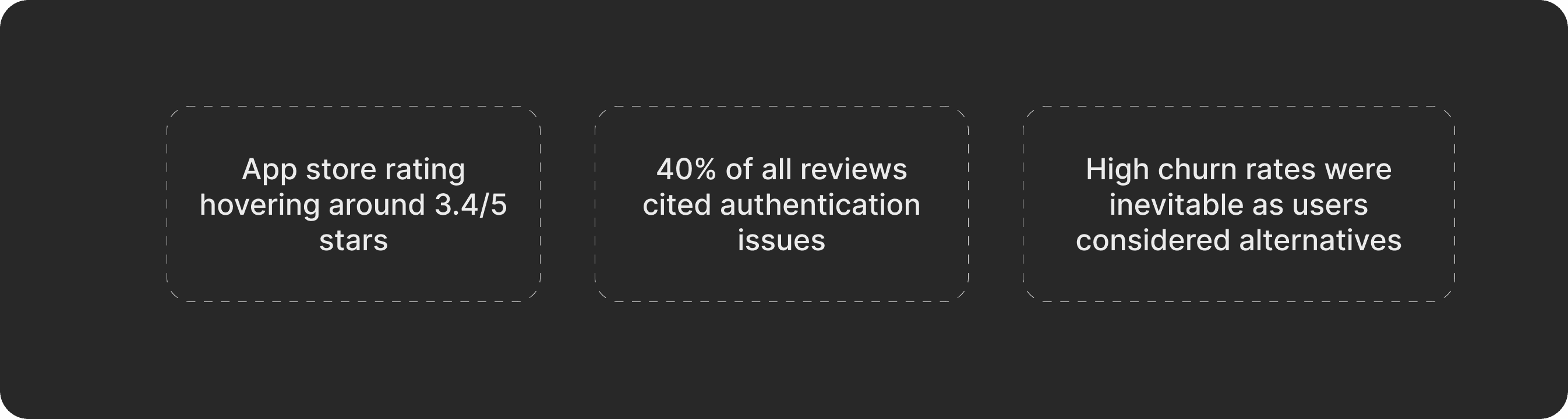
To understand users' pain points, I started where every good product story begins: listening to users, due to a lack of internal data, I reviewed feedback from the app store, which revealed a devastating pattern:
Customers faced the same frustrations repeatedly.
The core problems were systemic and interconnected. Based on user review analysis four critical pain points were highlighted:
Problem Category | Impact (% of Reviews) | User Frustrations |
|---|---|---|
Authentication Issues | 40% | Friction & repetition (Manual login instead of biometric access) |
Feature Gaps | 25% | Users expected more personalisation |
Usability & Efficiency | 15% | Frustration & impatience (“Why is this taking forever?”) |
Wallet Management | 20% | Difficult to move or track funds. |
The initial platform looked like this:

Key Findings
Users weren't leaving because AXA Mansard lacked features—they were leaving because the features they had didn't work intuitively.
Business Impact
Quantifying the Cost of Poor Design
Opportunity
By fixing authentication, wallet clarity, and adding intelligent support, we could reduce churn and increase user retention.
Early Steps…
To kick-start possible design solutions, I turned likely use cases into detailed prompts to test ideas to see how functional these solutions would be to the users. I also sought technical inputs to understand how this could affect development. The goal was to :
Understand technical constraints early
Identify opportunities for innovative solutions
Ensure design concepts were buildable and scalable


Solution
From ideations to Figma Canvas
Redesigned Authentication Flow
Biometric authentication eliminates login friction, which causes 40% of complaints, thereby preventing churn while increasing transaction completion and daily usage.


Improved Wallet Dashboard
Wallet dashboard improvements eliminate fund management difficulties, reducing transaction abandonment while building trust that drives higher transaction volume and frequency - directly increasing revenue through improved user confidence.

AI-Enhanced Solutions
AI integration enhances user personalisation by suggesting relevant savings goals and insurance products, making users feel understood rather than ignored. This keeps people engaged and creates loyalty.

Streamlined Insurance Experience
The streamlined insurance experience makes insurance actually usable - people can find relevant policies, track everything in one place, and file claims without headaches. This drives more policy sales since users aren't intimidated by complexity.

Conclusion
Key Learnings
1. Trust is earned through microinteractions
Every login, transaction, and support moment either builds or destroys confidence. AXA Mansard was bleeding trust through a thousand small cuts.
2. Start with the problem, not the solution
Forcing myself to analyse reviews before opening Figma revealed problems I would have completely missed.
3. Constraints breed clarity
Limited time made me prioritise ruthlessly. If I had 6 months, I'd have overthought everything and diluted the core insights.
4. Technical feasibility shapes a better design
Researching implementation early prevented me from designing impossible solutions.
Conclusion
I believe that these solutions can create an opportunity for AXA Mansard to have a competitive edge amongst its peers in the fintech space. With the integration of these features and design solutions, this could be an avenue for scaling the product offerings.


AXA Mansard
Categories
Fintech
Mobile App
AI
Duration
2025
Role
Product Designer
Client
Axa Mansard
Overview
Redesigning for Impact: Establishing Market Competitiveness and Restoring User Confidence.
After failing to log into the AXA Mansard app three times in one session, I identified a critical problem: the app was losing users because existing features were difficult to use, not because features were missing. As both a user and designer, I saw an opportunity to fix the core usability issues driving customers away.
AXA Mansard is a Nigerian fintech/Insurance platform. AXA Mansard faces existential risk competing against fintech leaders like PiggyVest and Cowrywise that set higher UX standards in Nigeria.
The goal was to focus on strategic repositioning through design.
The Problem
The User's Nightmare 😥😥
To understand users' pain points, I started where every good product story begins: listening to users, due to a lack of internal data, I reviewed feedback from the app store, which revealed a devastating pattern:
Customers faced the same frustrations repeatedly.
The core problems were systemic and interconnected. Based on user review analysis four critical pain points were highlighted:
Problem Category | Impact (% of Reviews) | User Frustrations |
|---|---|---|
Authentication Issues | 40% | Friction & repetition (Manual login instead of biometric access) |
Feature Gaps | 25% | Users expected more personalisation |
Usability & Efficiency | 15% | Frustration & impatience (“Why is this taking forever?”) |
Wallet Management | 20% | Difficult to move or track funds. |
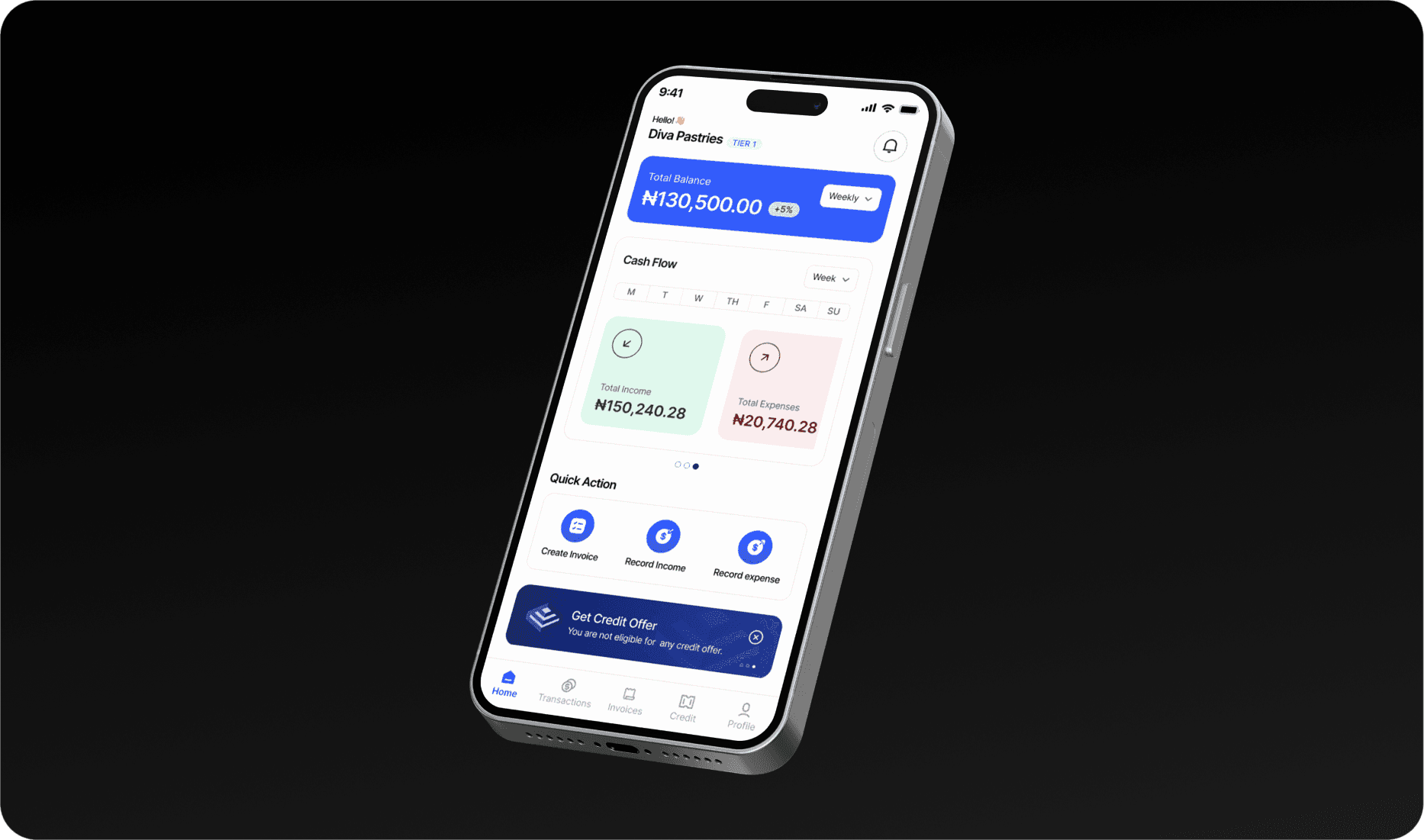
The initial platform looked like this:
Key Findings
Users weren't leaving because AXA Mansard lacked features—they were leaving because the features they had didn't work intuitively.
Business Impact
Quantifying the Cost of Poor Design
Opportunity
By fixing authentication, wallet clarity, and adding intelligent support, we could reduce churn and increase user retention.
Early Steps…
To kick-start possible design solutions, I turned likely use cases into detailed prompts to test ideas to see how functional these solutions would be to the users. I also sought technical inputs to understand how this could affect development. The goal was to :
Understand technical constraints early
Identify opportunities for innovative solutions
Ensure design concepts were buildable and scalable
Solution
From ideations to Figma Canvas
Redesigned Authentication Flow
Biometric authentication eliminates login friction, which causes 40% of complaints, thereby preventing churn while increasing transaction completion and daily usage.
Improved Wallet Dashboard
Wallet dashboard improvements eliminate fund management difficulties, reducing transaction abandonment while building trust that drives higher transaction volume and frequency - directly increasing revenue through improved user confidence.
AI-Enhanced Solutions
AI integration enhances user personalisation by suggesting relevant savings goals and insurance products, making users feel understood rather than ignored. This keeps people engaged and creates loyalty.
Streamlined Insurance Experience
The streamlined insurance experience makes insurance actually usable - people can find relevant policies, track everything in one place, and file claims without headaches. This drives more policy sales since users aren't intimidated by complexity.
Conclusion
Key Learnings
1. Trust is earned through microinteractions
Every login, transaction, and support moment either builds or destroys confidence. AXA Mansard was bleeding trust through a thousand small cuts.
2. Start with the problem, not the solution
Forcing myself to analyse reviews before opening Figma revealed problems I would have completely missed.
3. Constraints breed clarity
Limited time made me prioritise ruthlessly. If I had 6 months, I'd have overthought everything and diluted the core insights.
4. Technical feasibility shapes a better design
Researching implementation early prevented me from designing impossible solutions.
Conclusion
I believe that these solutions can create an opportunity for AXA Mansard to have a competitive edge amongst its peers in the fintech space. With the integration of these features and design solutions, this could be an avenue for scaling the product offerings.
AXA Mansard
Categories
Fintech
Mobile App
AI
Duration
2025
Role
Product Designer
Client
Axa Mansard
Overview
Redesigning for Impact: Establishing Market Competitiveness and Restoring User Confidence.
After failing to log into the AXA Mansard app three times in one session, I identified a critical problem: the app was losing users because existing features were difficult to use, not because features were missing. As both a user and designer, I saw an opportunity to fix the core usability issues driving customers away.
AXA Mansard is a Nigerian fintech/Insurance platform. AXA Mansard faces existential risk competing against fintech leaders like PiggyVest and Cowrywise that set higher UX standards in Nigeria.
The goal was to focus on strategic repositioning through design.
The Problem
The User's Nightmare 😥😥
To understand users' pain points, I started where every good product story begins: listening to users, due to a lack of internal data, I reviewed feedback from the app store, which revealed a devastating pattern:
Customers faced the same frustrations repeatedly.
The core problems were systemic and interconnected. Based on user review analysis four critical pain points were highlighted:
Problem Category | Impact (% of Reviews) | User Frustrations |
|---|---|---|
Authentication Issues | 40% | Friction & repetition (Manual login instead of biometric access) |
Feature Gaps | 25% | Users expected more personalisation |
Usability & Efficiency | 15% | Frustration & impatience (“Why is this taking forever?”) |
Wallet Management | 20% | Difficult to move or track funds. |
The initial platform looked like this:
Key Findings
Users weren't leaving because AXA Mansard lacked features—they were leaving because the features they had didn't work intuitively.
Business Impact
Quantifying the Cost of Poor Design
Opportunity
By fixing authentication, wallet clarity, and adding intelligent support, we could reduce churn and increase user retention.
Early Steps…
To kick-start possible design solutions, I turned likely use cases into detailed prompts to test ideas to see how functional these solutions would be to the users. I also sought technical inputs to understand how this could affect development. The goal was to :
Understand technical constraints early
Identify opportunities for innovative solutions
Ensure design concepts were buildable and scalable
Solution
From ideations to Figma Canvas
Redesigned Authentication Flow
Biometric authentication eliminates login friction, which causes 40% of complaints, thereby preventing churn while increasing transaction completion and daily usage.
Improved Wallet Dashboard
Wallet dashboard improvements eliminate fund management difficulties, reducing transaction abandonment while building trust that drives higher transaction volume and frequency - directly increasing revenue through improved user confidence.
AI-Enhanced Solutions
AI integration enhances user personalisation by suggesting relevant savings goals and insurance products, making users feel understood rather than ignored. This keeps people engaged and creates loyalty.
Streamlined Insurance Experience
The streamlined insurance experience makes insurance actually usable - people can find relevant policies, track everything in one place, and file claims without headaches. This drives more policy sales since users aren't intimidated by complexity.
Conclusion
Key Learnings
1. Trust is earned through microinteractions
Every login, transaction, and support moment either builds or destroys confidence. AXA Mansard was bleeding trust through a thousand small cuts.
2. Start with the problem, not the solution
Forcing myself to analyse reviews before opening Figma revealed problems I would have completely missed.
3. Constraints breed clarity
Limited time made me prioritise ruthlessly. If I had 6 months, I'd have overthought everything and diluted the core insights.
4. Technical feasibility shapes a better design
Researching implementation early prevented me from designing impossible solutions.
Conclusion
I believe that these solutions can create an opportunity for AXA Mansard to have a competitive edge amongst its peers in the fintech space. With the integration of these features and design solutions, this could be an avenue for scaling the product offerings.