Badu
Categories
Saas
Web App
B2B
Duration
2024
Role
UX Design
Client
Badu
Overview
Redesigning Badu's CRM Admin Platform to improve operational control and Client Resolution Process.
Badu is a comprehensive CRM platform designed to help enterprises manage, track, and resolve client complaints efficiently. The application serves as a central hub for customer service teams, enabling them to maintain optimal client relationships through streamlined issue resolution processes.
The Problem
Underlying Product Challenge
Following extensive stakeholder interviews and user research, we identified that the existing resolution flow was severely hindering customer service operations. The outdated interface and fragmented workflows were causing significant operational inefficiencies.

How might we empower support teams to efficiently manage and resolve client complaints with confidence and clarity?
Being able to define the problem, we as a team need to define what our process would be like and work in line with it.

Opportunity
Redefining the User Experience
Knowing the platform needed a fix was one thing, but knowing what exactly to fix was the challenge; just having conversations with stakeholders was enough to dive into Figma. So as a team, we took the time to review the existing platform
Our UX Audit and review of the platform revealed several key pain points:
No clear onboarding process
The platform lacked an onboarding process that would help new users understand how the platform worked, as most Saas platforms can be quite complex at first glance, which we believed was hindering the complete admin control of the platform.
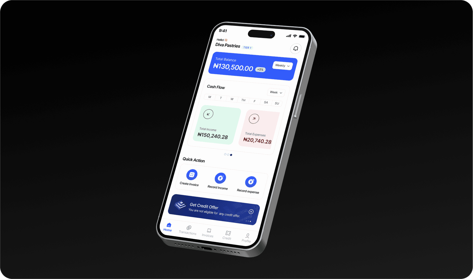
No dashboard
During the review of the current platform, we discovered it had no existing dashboard that would help admins make an informed decision. The lack of a dashboard made admins operate blindly as they could not measure how effectively they managed these clients' complaints.
Operational management was ineffective
From assigning tasks to team members to navigating through existing conversations with clients, the platform lacked a clear user journey on how admins could manage daily operations on the platform.
Lacked proper documentation of client information
For some reason, client information was more or less none existent as the current platform did not capture the necessary information of the clients.

Next steps… Defining navigation paths and flows
For our next steps, we focused on converting these issues or problems into user-friendly solutions. The focus was on establishing a solid information architecture. This involved organising and structuring the content and functionality of the app logically and intuitively to ensure a seamless user experience.

Solution
Optimising the sign-up & onboarding process
I designed an intuitive signup process, making it easy for first-time users to get signed up. Additionally, I introduced a "Get Started" screen to get acquainted with the basics. We also simplified the process of adding team members.

Client Resolution Process - Managing Tickets
I improved the client support process by managing all client issues and tickets from one place. The admin can easily see issues that are not resolved and quickly assign them to team members.


An intuitive way to manage chats
I created an intuitive system for filtering and updating chat statuses, helping admins manage client conversations more smoothly. This improved response times and reduced delays in solving client issues.
Conclusion
The redesign of the CRM SaaS project represents a significant step forward in improving user experience and usability. The new interface promises to address pain points, enhance user satisfaction, and optimise workflow efficiency through collaborative communication, empathetic design, and iterative prototyping.
While lacking live metrics, early user feedback and internal testing indicate a positive reception, suggesting that the redesign holds substantial potential to positively impact user engagement and product adoption upon launch.


Badu
Categories
Saas
Web App
B2B
Duration
2024
Role
UX Design
Client
Badu
Overview
Redesigning Badu's CRM Admin Platform to improve operational control and Client Resolution Process.
Badu is a comprehensive CRM platform designed to help enterprises manage, track, and resolve client complaints efficiently. The application serves as a central hub for customer service teams, enabling them to maintain optimal client relationships through streamlined issue resolution processes.
The Problem
Underlying Product Challenge
Following extensive stakeholder interviews and user research, we identified that the existing resolution flow was severely hindering customer service operations. The outdated interface and fragmented workflows were causing significant operational inefficiencies.
How might we empower support teams to efficiently manage and resolve client complaints with confidence and clarity?
Being able to define the problem, we as a team need to define what our process would be like and work in line with it.
Opportunity
Redefining the User Experience
Knowing the platform needed a fix was one thing, but knowing what exactly to fix was the challenge; just having conversations with stakeholders was enough to dive into Figma. So as a team, we took the time to review the existing platform
Our UX Audit and review of the platform revealed several key pain points:
No clear onboarding process
The platform lacked an onboarding process that would help new users understand how the platform worked, as most Saas platforms can be quite complex at first glance, which we believed was hindering the complete admin control of the platform.
No dashboard
During the review of the current platform, we discovered it had no existing dashboard that would help admins make an informed decision. The lack of a dashboard made admins operate blindly as they could not measure how effectively they managed these clients' complaints.
Operational management was ineffective
From assigning tasks to team members to navigating through existing conversations with clients, the platform lacked a clear user journey on how admins could manage daily operations on the platform.
Lacked proper documentation of client information
For some reason, client information was more or less none existent as the current platform did not capture the necessary information of the clients.
Next steps… Defining navigation paths and flows
For our next steps, we focused on converting these issues or problems into user-friendly solutions. The focus was on establishing a solid information architecture. This involved organising and structuring the content and functionality of the app logically and intuitively to ensure a seamless user experience.
Solution
Optimising the sign-up & onboarding process
I designed an intuitive signup process, making it easy for first-time users to get signed up. Additionally, I introduced a "Get Started" screen to get acquainted with the basics. We also simplified the process of adding team members.
Client Resolution Process - Managing Tickets
I improved the client support process by managing all client issues and tickets from one place. The admin can easily see issues that are not resolved and quickly assign them to team members.
An intuitive way to manage chats
I created an intuitive system for filtering and updating chat statuses, helping admins manage client conversations more smoothly. This improved response times and reduced delays in solving client issues.
Conclusion
The redesign of the CRM SaaS project represents a significant step forward in improving user experience and usability. The new interface promises to address pain points, enhance user satisfaction, and optimise workflow efficiency through collaborative communication, empathetic design, and iterative prototyping.
While lacking live metrics, early user feedback and internal testing indicate a positive reception, suggesting that the redesign holds substantial potential to positively impact user engagement and product adoption upon launch.
Badu
Categories
Saas
Web App
B2B
Duration
2024
Role
UX Design
Client
Badu
Overview
Redesigning Badu's CRM Admin Platform to improve operational control and Client Resolution Process.
Badu is a comprehensive CRM platform designed to help enterprises manage, track, and resolve client complaints efficiently. The application serves as a central hub for customer service teams, enabling them to maintain optimal client relationships through streamlined issue resolution processes.
The Problem
Underlying Product Challenge
Following extensive stakeholder interviews and user research, we identified that the existing resolution flow was severely hindering customer service operations. The outdated interface and fragmented workflows were causing significant operational inefficiencies.
How might we empower support teams to efficiently manage and resolve client complaints with confidence and clarity?
Being able to define the problem, we as a team need to define what our process would be like and work in line with it.
Opportunity
Redefining the User Experience
Knowing the platform needed a fix was one thing, but knowing what exactly to fix was the challenge; just having conversations with stakeholders was enough to dive into Figma. So as a team, we took the time to review the existing platform
Our UX Audit and review of the platform revealed several key pain points:
No clear onboarding process
The platform lacked an onboarding process that would help new users understand how the platform worked, as most Saas platforms can be quite complex at first glance, which we believed was hindering the complete admin control of the platform.
No dashboard
During the review of the current platform, we discovered it had no existing dashboard that would help admins make an informed decision. The lack of a dashboard made admins operate blindly as they could not measure how effectively they managed these clients' complaints.
Operational management was ineffective
From assigning tasks to team members to navigating through existing conversations with clients, the platform lacked a clear user journey on how admins could manage daily operations on the platform.
Lacked proper documentation of client information
For some reason, client information was more or less none existent as the current platform did not capture the necessary information of the clients.
Next steps… Defining navigation paths and flows
For our next steps, we focused on converting these issues or problems into user-friendly solutions. The focus was on establishing a solid information architecture. This involved organising and structuring the content and functionality of the app logically and intuitively to ensure a seamless user experience.
Solution
Optimising the sign-up & onboarding process
I designed an intuitive signup process, making it easy for first-time users to get signed up. Additionally, I introduced a "Get Started" screen to get acquainted with the basics. We also simplified the process of adding team members.
Client Resolution Process - Managing Tickets
I improved the client support process by managing all client issues and tickets from one place. The admin can easily see issues that are not resolved and quickly assign them to team members.
An intuitive way to manage chats
I created an intuitive system for filtering and updating chat statuses, helping admins manage client conversations more smoothly. This improved response times and reduced delays in solving client issues.
Conclusion
The redesign of the CRM SaaS project represents a significant step forward in improving user experience and usability. The new interface promises to address pain points, enhance user satisfaction, and optimise workflow efficiency through collaborative communication, empathetic design, and iterative prototyping.
While lacking live metrics, early user feedback and internal testing indicate a positive reception, suggesting that the redesign holds substantial potential to positively impact user engagement and product adoption upon launch.