Lokate.Africa

Designing one urban‑discovery platform for the people going out and the businesses hosting them.
Own the whole night out
Users didn't need another events app, another booking app, or another restaurant directory . The goal was to become the single destination for urban discovery, connecting three disconnected verticals — events, dining, accommodation into one intelligent, two-sided platform. The win condition wasn't feature parity with any one competitor; it was owning the full journey.
Events
ROLE
UI/UX DESIGN
YEAR
2024
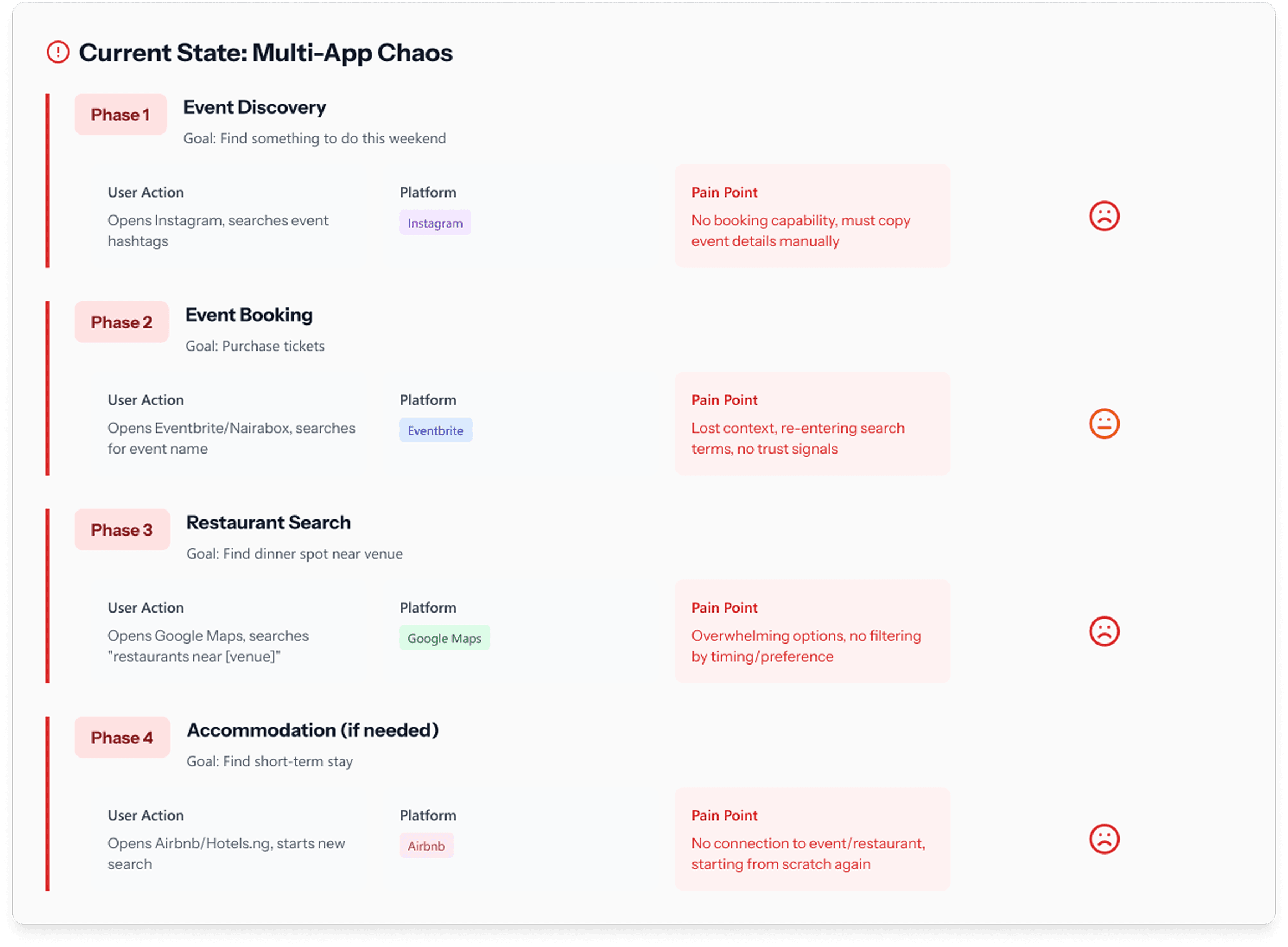
PROBLEM
One night out, three apps, no thread
Planning a Friday in Lagos meant opening three apps: one for events, one for restaurants, one to compare prices, with nothing connecting the decisions. Someone buying a concert ticket almost certainly needs dinner nearby and, often, somewhere to stay.

ROLE
Sole designer, two Interfaces
As the solo designer, I owned the end-to-end UI/UX design across two parallel interfaces built on one shared system: the explorer-facing app (discovery, browsing, booking, payments) and the organiser-facing platform (listing creation, booking management, edits). I also worked on user research, information architecture, interaction design, flow design and the component system, working directly with the product owner and 2 engineers through the build cycle ahead of v1 launch.
OPPORTUNITY
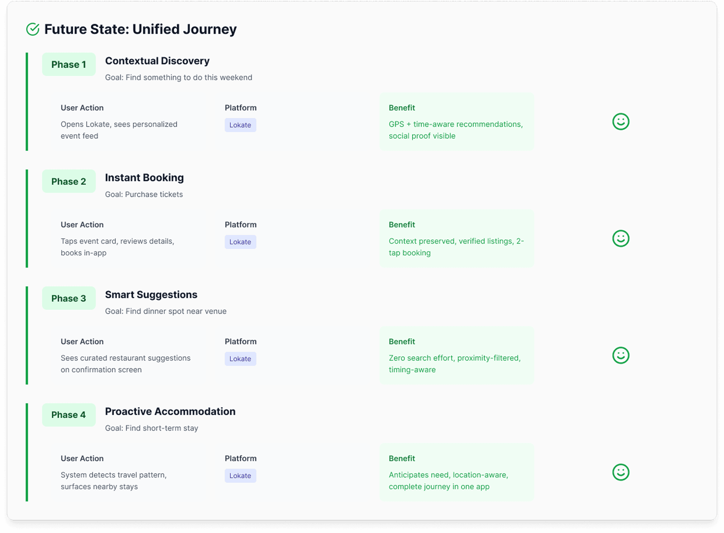
Anticipate, don't wait to be searched
If discovery, validation, and booking lived in a single flow, the system could anticipate user needs rather than waiting for a search field.
Two personas anchored every decision — the Weekend Planner organising a night out, and the Business Nomad finding quality fast on a tight schedule. The opportunity was to design for their whole journey, not isolated touchpoints.

APPROACH
Map the current state, build one system
I started by mapping the current-state journey across all three verticals to see exactly where people lost context, switched apps, and made decisions in isolation. The fix wasn't a better events screen; it was a shared system so explorers and organisers stop being two products bolted together and start being two roles on the same system.
Four bets, one logic
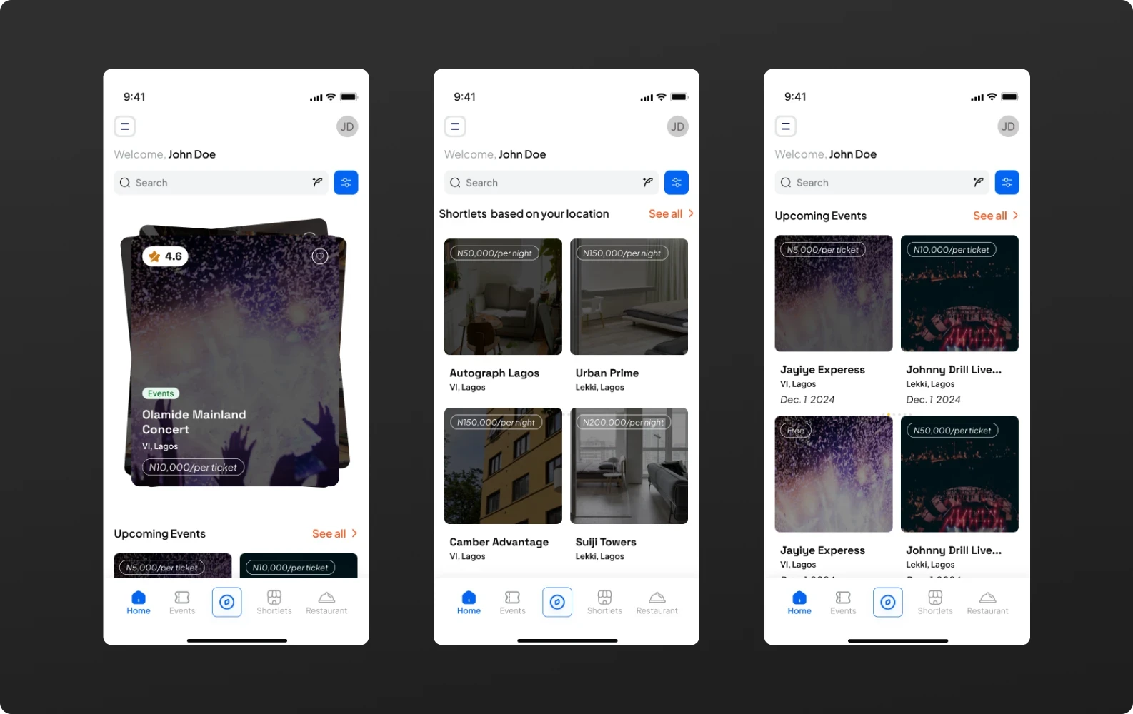
Context-aware home over a static feed
The feed adapts to time, location and behaviour, so the home screen does the first round of filtering before the user has to.
Conversational discovery over dropdown filters
Paye, the AI assistant, was scoped for the moments research showed people stalling. "Jazz clubs near VI" resolves ambiguous intent faster than a stack of filter menus.
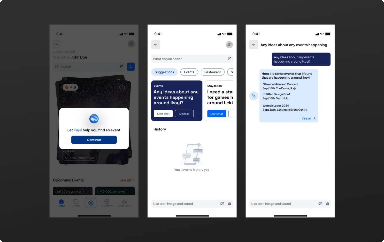
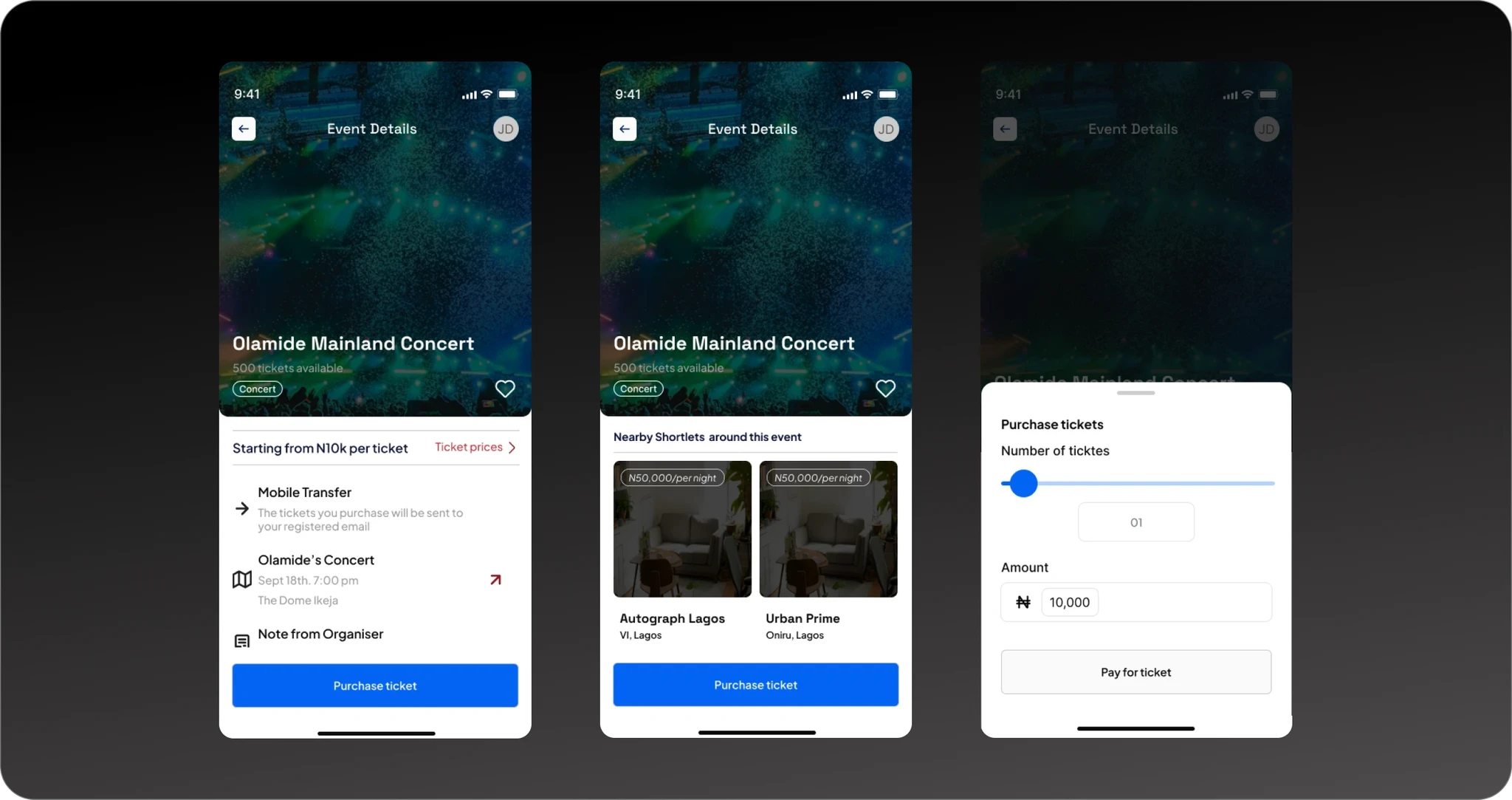
Cross-category bridges at confirmation
Booking confirmation became a launchpad, not a dead end. A concert ticket surfaces nearby dinner and travel-stay options in the same flow, in one session.
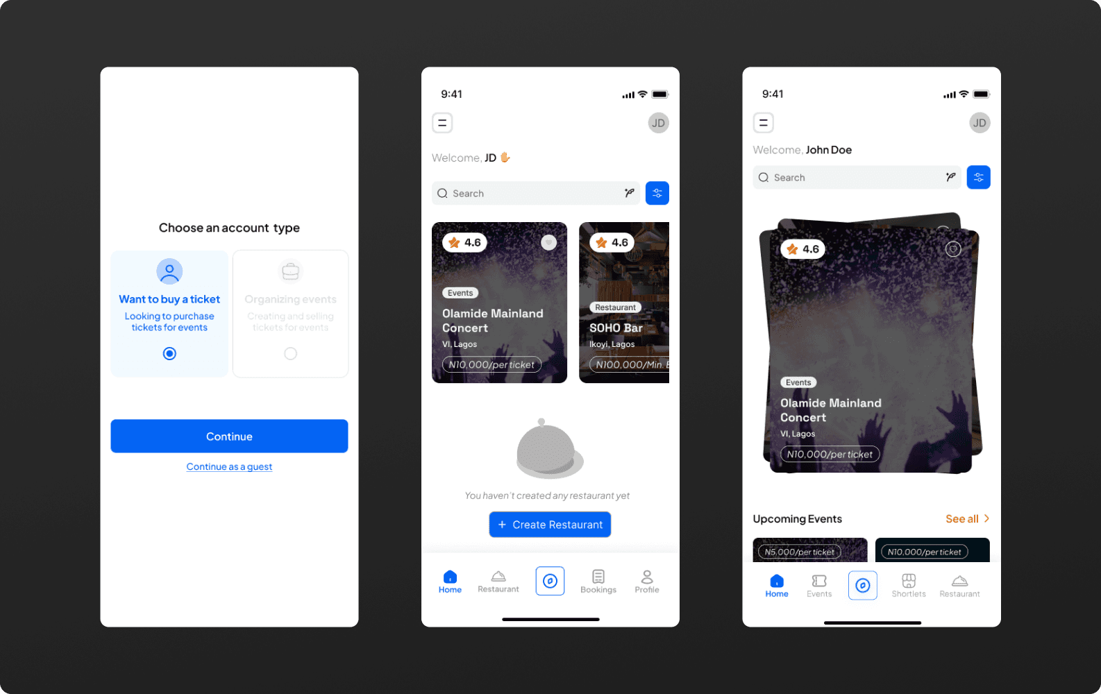
One IA for both sides of the marketplace
The Organisers reuse the same navigation and visual language as the event explorer, instead of shipping as a bolted-on admin panel. A host and a guest never feel like they're in two different products.
OUTCOME
What shipped into the design
While this was still in development, here are some key impacts worth noting.
01
Unified three previously separate planning apps- events, dining, and stays into a single information architecture.
02
Collapsed the booking decision path from app-switching across platforms into one in-session flow: discover, validate, book.
03
Every flow traces back to a research-backed blocker: abandonment, trust, social proof, time-on-task, rather than to a feature request.


LEARNINGS
What the work taught me
Designing for two different types of users took more effort at the start, but it made things easier later because both groups used the same navigation system, allowing new features to be added without redesigning everything.
Trust was built into the design, not added as a separate feature. We made sure reviews and proof were visible on most screens instead of hiding them in a tab people might never check.
An AI assistant only earns its place on the home screen if it resolves a real moment of decision paralysis. Paye was scoped around where research showed people stalling.