AXA Mansard
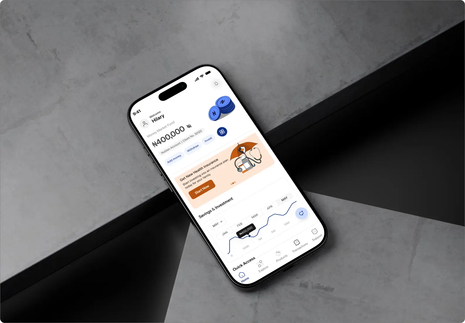
Redesigning AXA Mansard for Market Leadership
AXA Mansard is a leading Nigerian insurance and investment platform operating in a market where fintech players like PiggyVest and Cowrywise have dramatically raised user expectations. While the product had real features, poor UX execution was driving users away.
The project originated from a personal experience — after failing to log in three consecutive times, I recognised that the problem wasn't missing features; it was existing features built without empathy. The goal was strategic repositioning through design: make AXA Mansard feel as polished and trustworthy as the competition.
FINTECH
ROLE
UX DESIGNER
YEAR
2025
Voices From The App Store
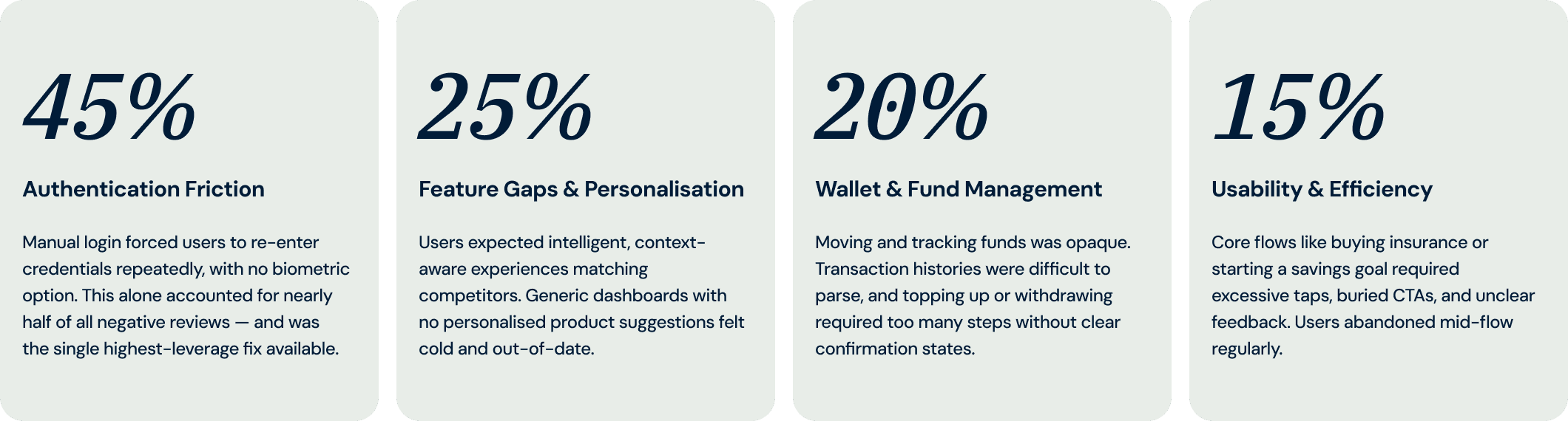
Without access to internal analytics, app store reviews became the primary research tool. Four systemic pain points emerged — each one a churn driver in disguise.
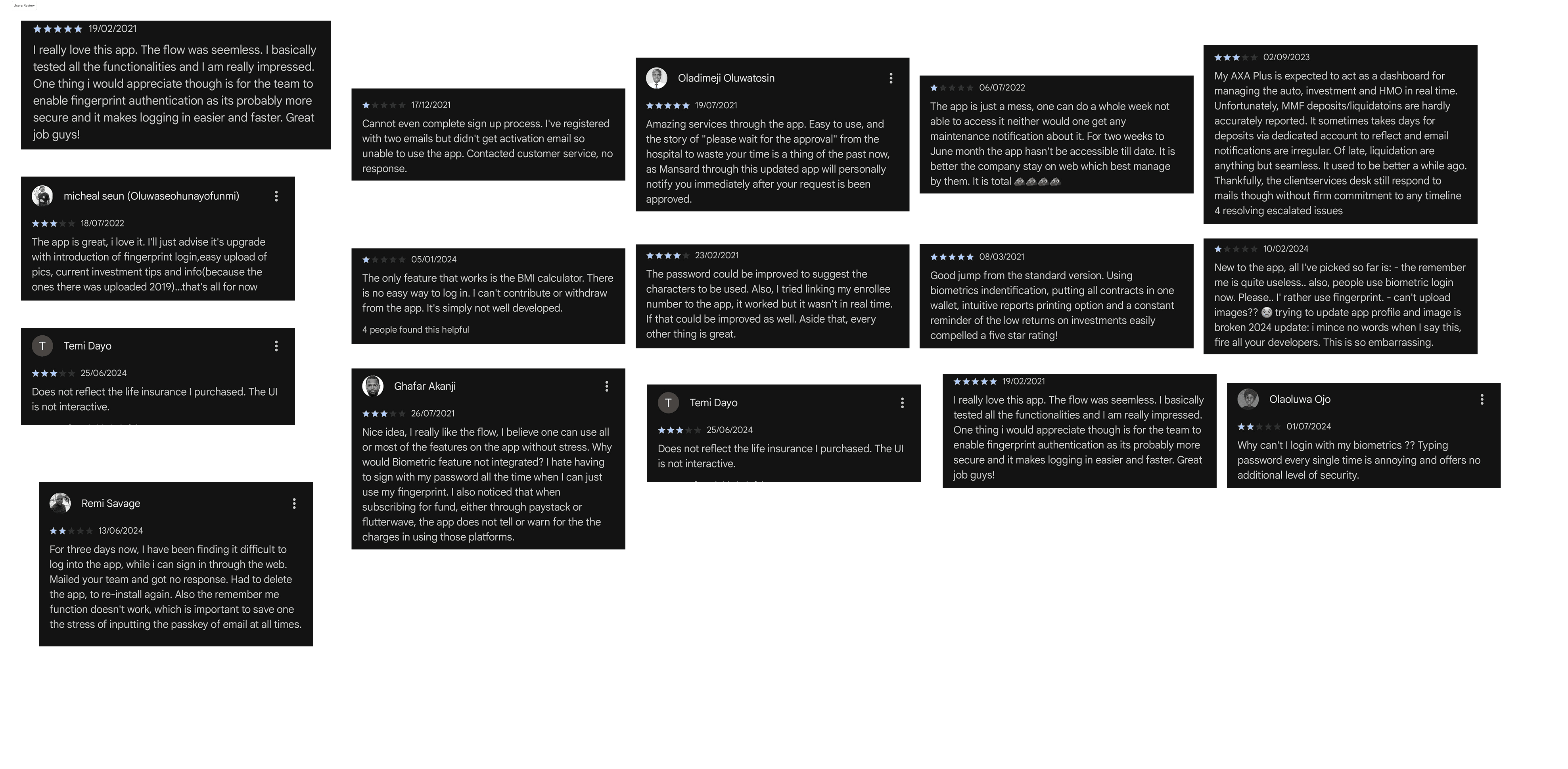
Screenshots of some of the app reviews

As a side project, I played key roles which made this project fun!
As a UX designer, I carried out a UX audit on the current app, leveraging app store reviews, which built the foundation of my design solution.
Designed an AI assistant solution that would help users navigate features faster.
Designed key user flows and architecture based on user findings that cover the highest-impact journeys.
To self-test, I prototype key screens to validate my ideas and recommendations.
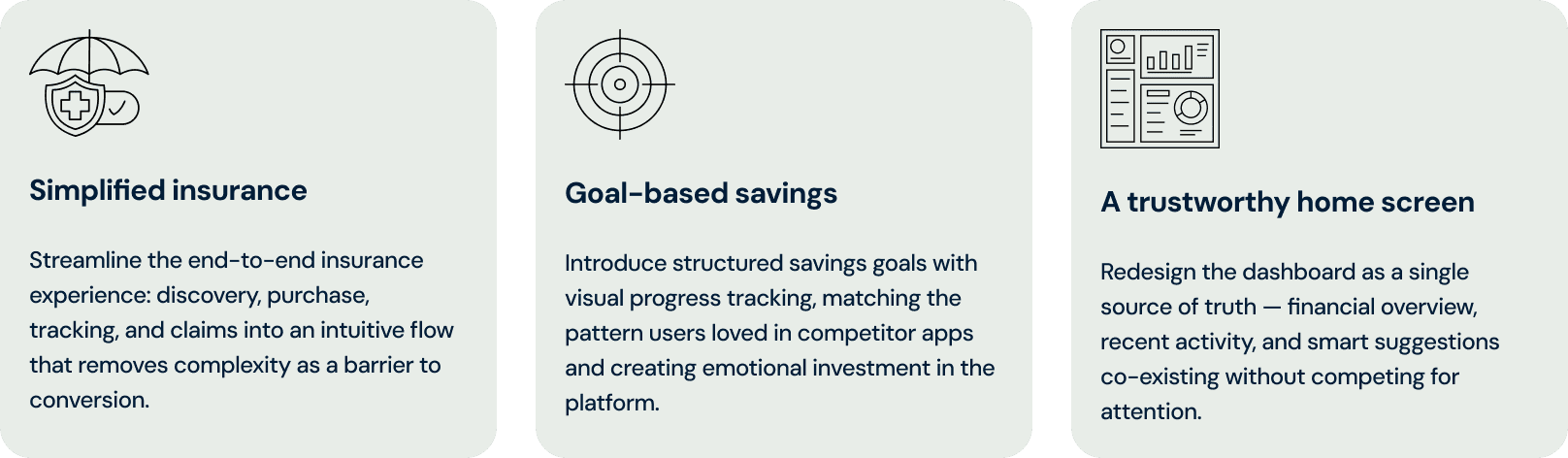
Where Design Could Win
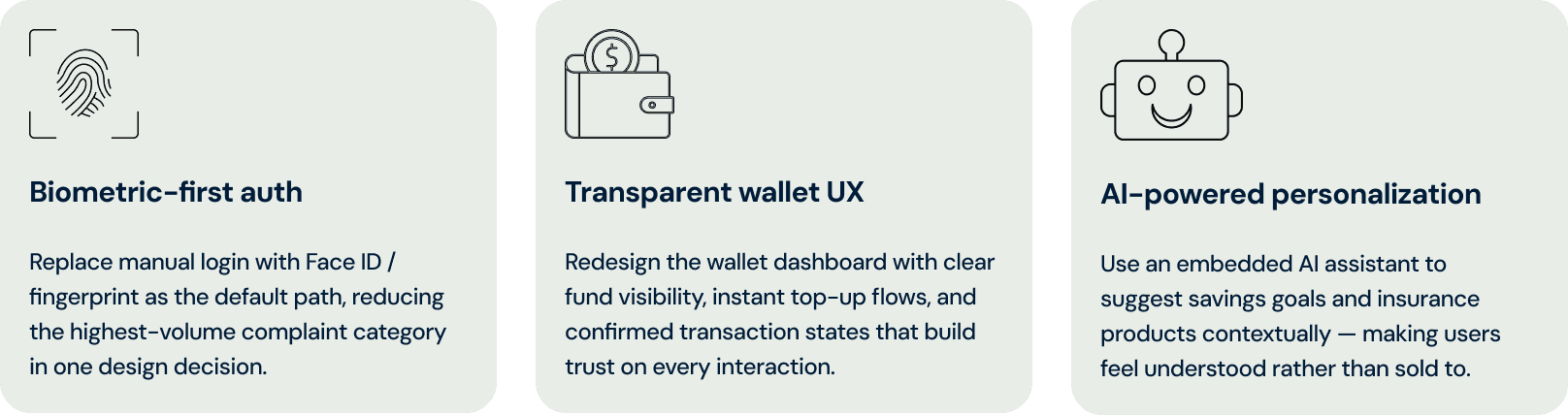
Each pain point was a direct opportunity to close the gap, not by adding more features, but by making existing ones work with less friction.

How the Work Was Done
A constrained timeline demanded ruthless prioritisation.
01
App Store Review Mining
Without access to internal analytics, public app store reviews became the primary research corpus. Every review was categorised by pain point type, frequency, and severity, producing a prioritised problem hierarchy that grounded all design decisions in real user frustration rather than assumption.
02
AI-Assisted Ideation & Technical Validation
Likely use cases were turned into detailed prompts to pressure-test design concepts before they reached Figma.
03
Ruthless Prioritisation
With limited time, every design decision was forced through a single question: does this solve one of the four documented pain points? Anything that didn't map directly to a proven user frustration was deferred. This kept scope tight and impact high.
Why These Choices, Not Others
Each decision was made in response to a specific user pain point, with a clear rationale for why it solves the problem better than an alternative approach.
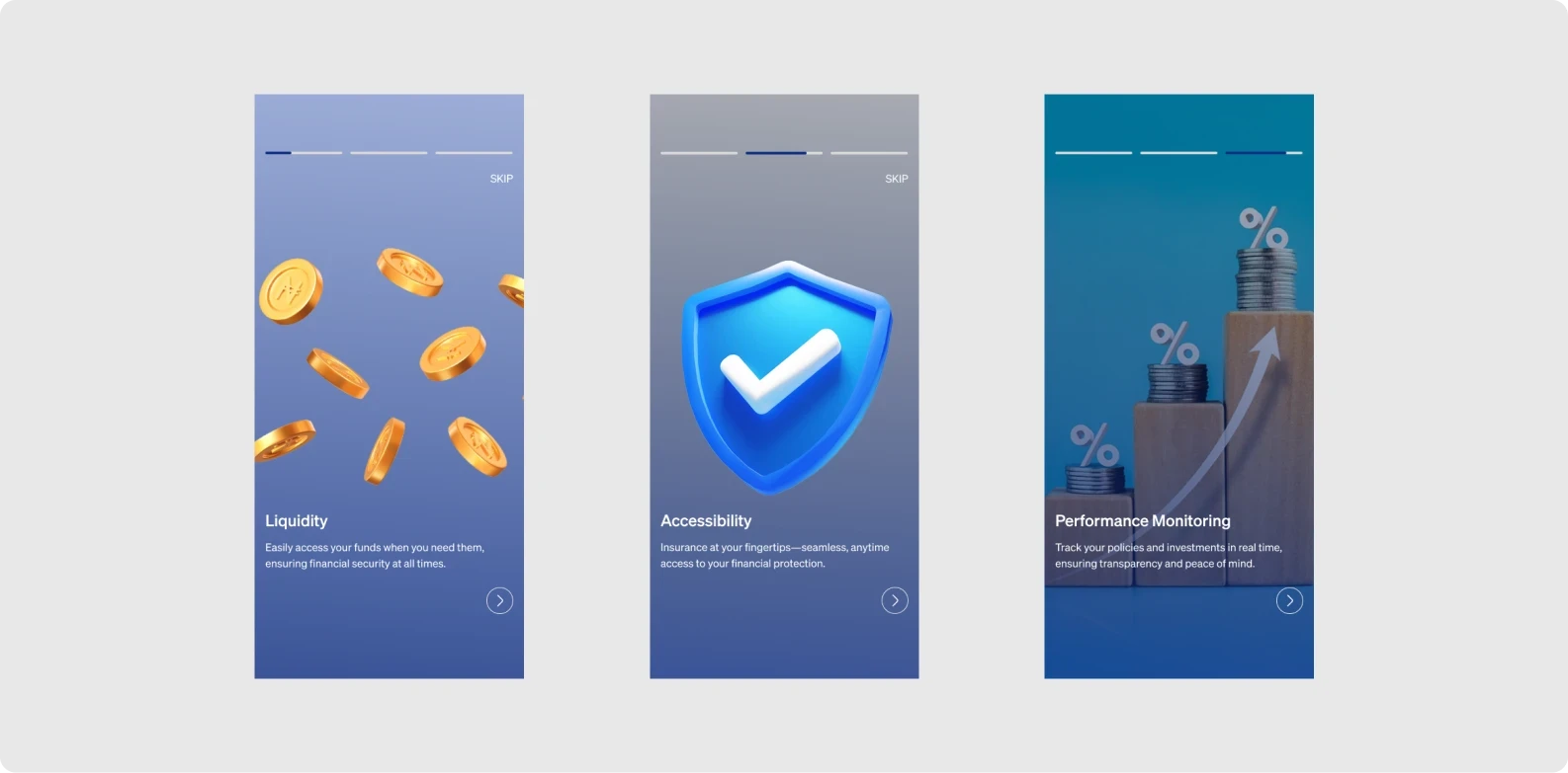
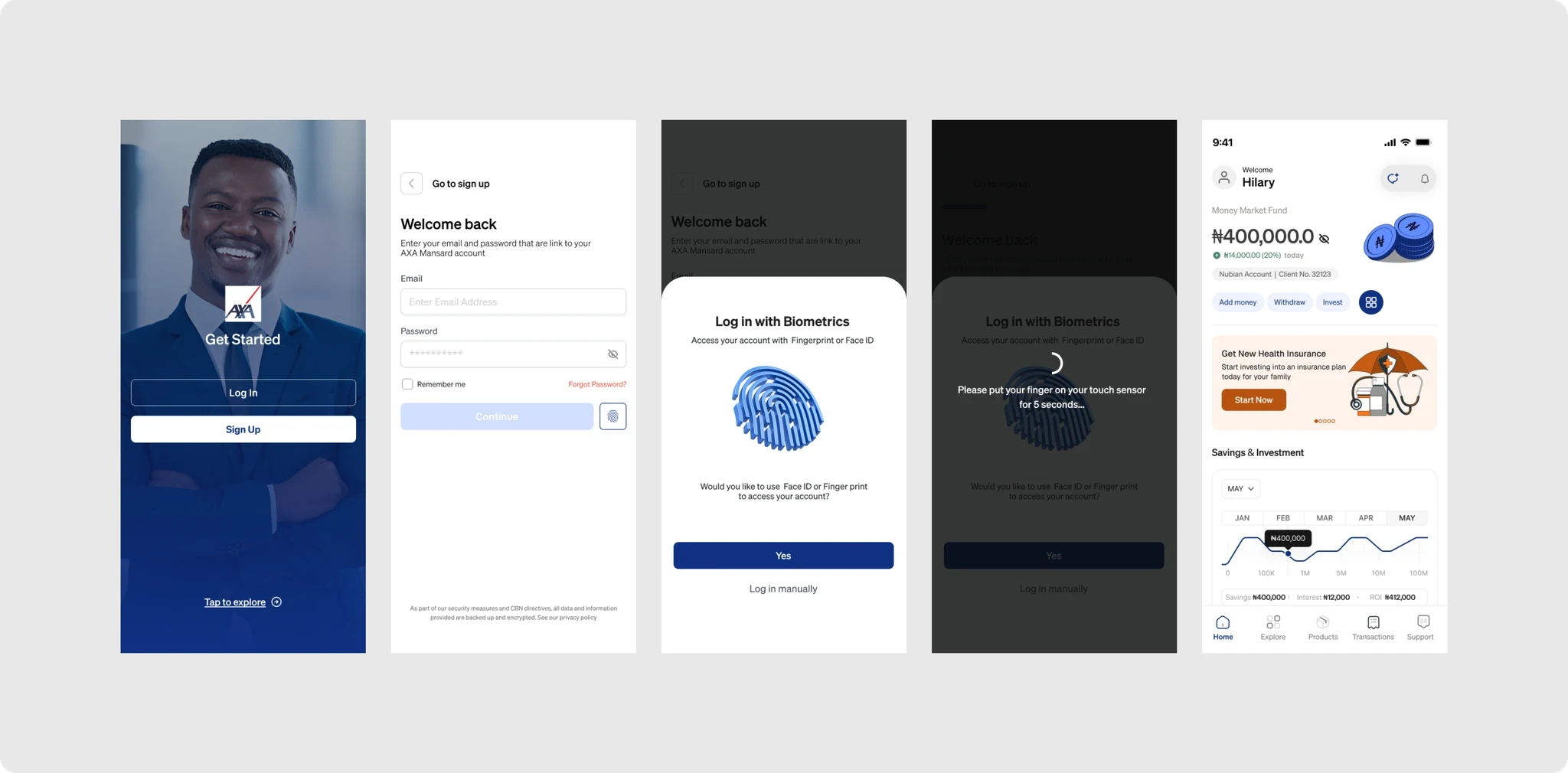
Biometric as Default Auth, Not Optional
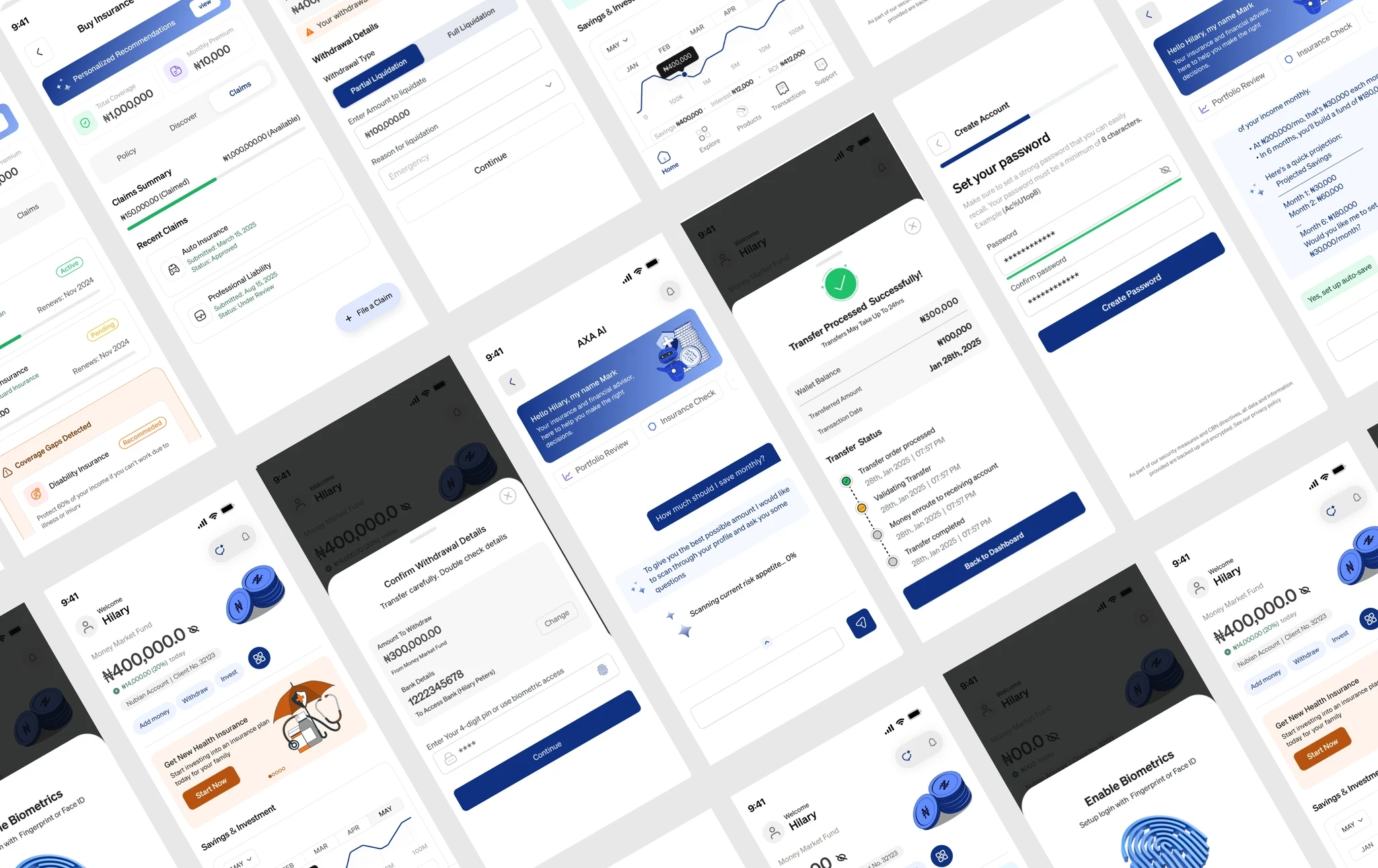
Rather than adding biometrics as a buried setting (which would change nothing for most users), it was surfaced during onboarding as the primary login method. Manual password/PIN became the fallback.
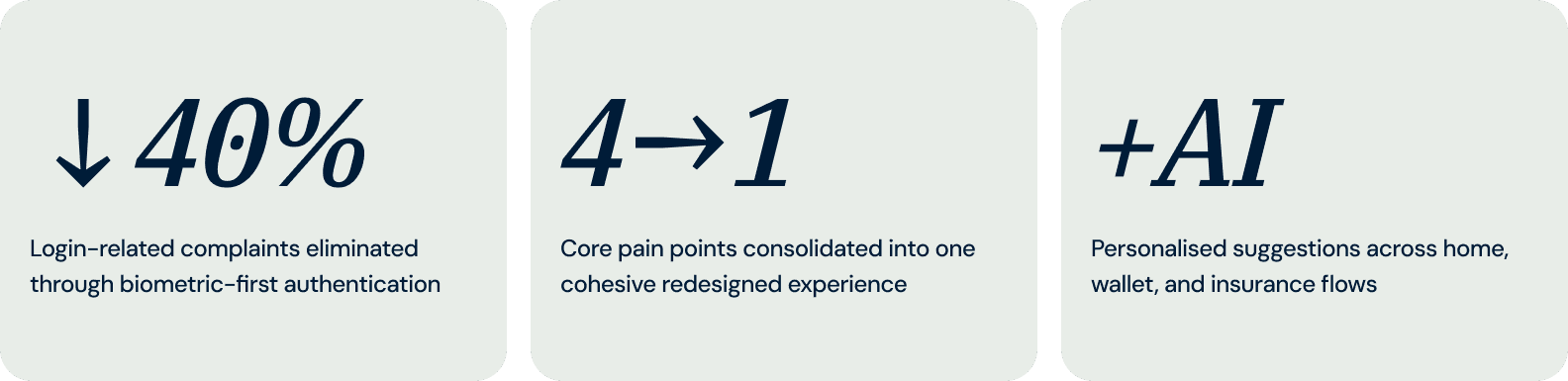
RATIONAL: The 40% complaint rate proved that users who could enable biometrics weren't. Making it opt-out rather than opt-in is the only way to move the metric.
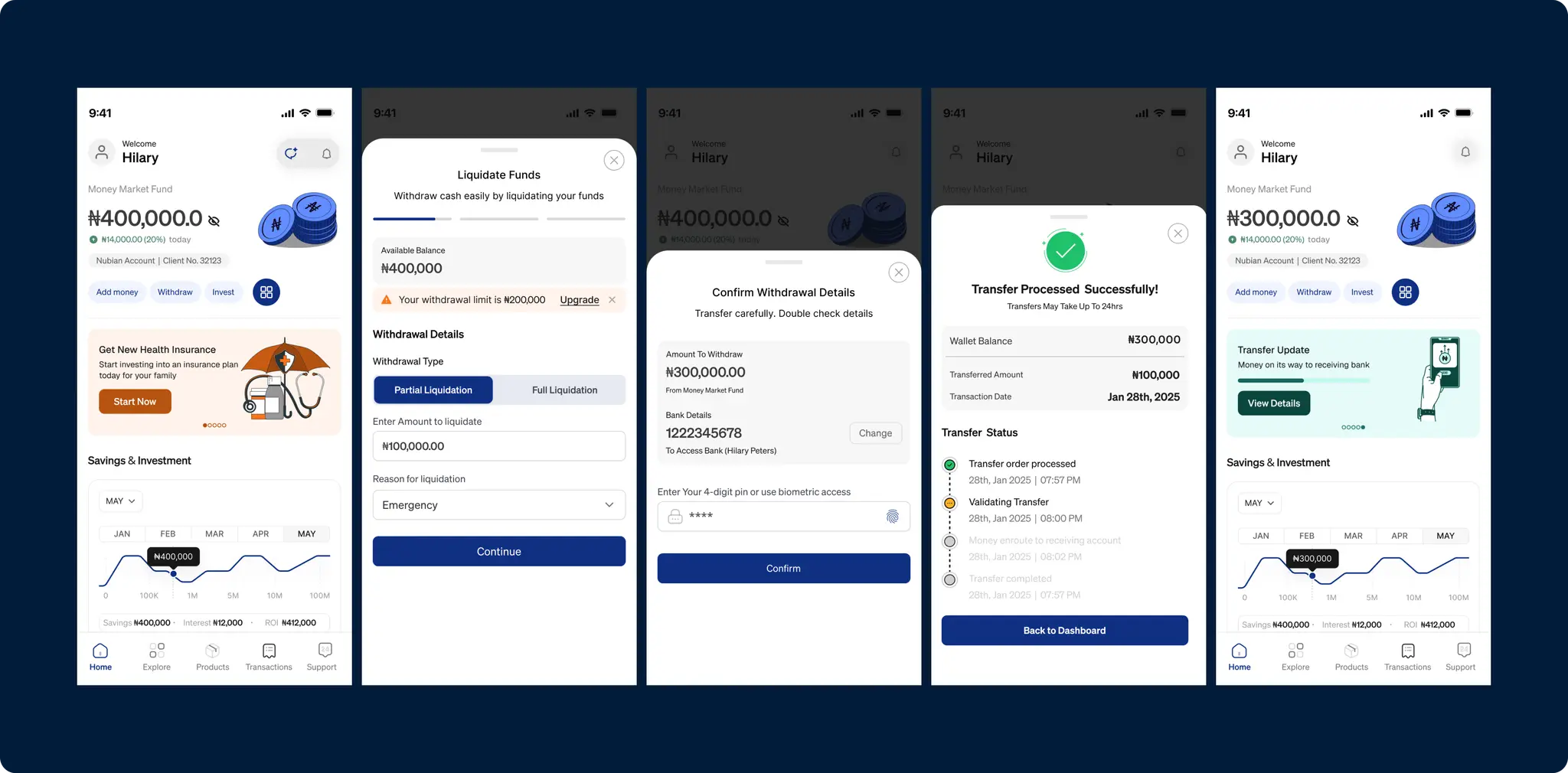
Wallet Dashboard as the Emotional Anchor
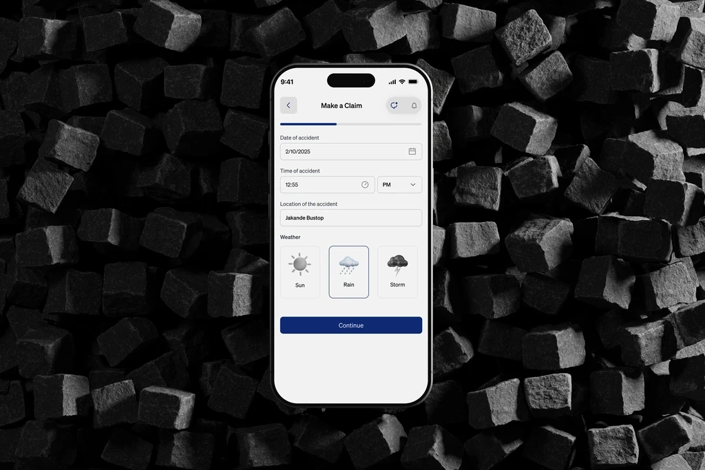
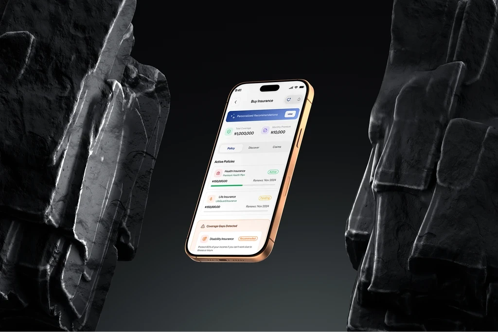
The wallet redesign prioritised clear balance visibility and instant confirmation states over adding features.
RATIONAL: Financial anxiety is a primary driver of abandonment. Removing ambiguity in fund displays directly addresses the emotional root cause, not just the surface complaint.
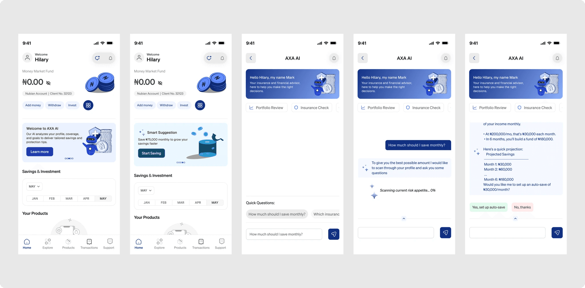
AI as a Contextual Nudge, Not Just a Chatbot
Rather than a standalone AI chat feature, intelligence was woven into existing flows — suggesting savings goals on the home screen, surfacing relevant insurance when users browsed wallet activity, and personalising CTAs based on behaviour.
RATIONAL: Users who feel ignored leave. Users who feel understood stay. Ambient AI creates loyalty without adding navigation complexity.
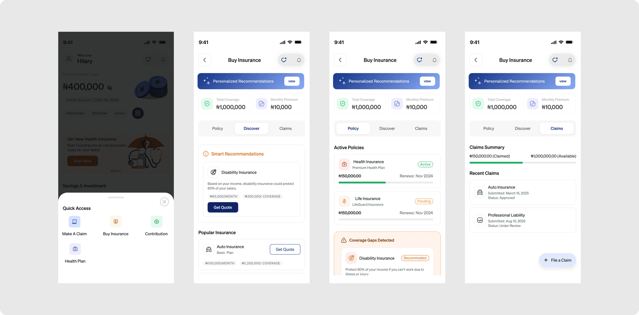
Insurance Discovery Before Purchase Complexity
The insurance redesign treated browsing and understanding as the primary design problem, not the purchase form. If users can't find or understand a policy, the purchase form never matters. Category filters, plain-language summaries, and AI suggestions were introduced before the buy flow.
RATIONAL: Insurance is inherently complex and anxiety-inducing. Reducing complexity at the discovery stage increases conversion at checkout.
Projected Design Impact
While this was a redesign concept rather than a shipped product, the design decisions were tied to measurable business outcomes — each one grounded in the original audit data.

What This Project Taught
01
Public data is real data
App store reviews, when systematically categorised, produce a surprisingly accurate picture of user frustration hierarchy. The absence of internal analytics forced a more creative but equally valid research method
02
Trust is earned in microinteractions
The redesign treated every interaction state as a trust moment, not a technical requirement.
03
Ruthless Prioritisation
With limited time, every design decision was forced through a single question: does this solve one of the four documented pain points? Anything that didn't map directly to a proven user frustration was deferred. This kept scope tight and impact high.
"The biggest insight wasn't about the app, it was about the methodology. Constraint breeds clarity. A six-month project with full internal data access might have produced a more complete audit, but it also might have produced a more diluted set of priorities. The time constraint made every decision count."

